
Prototype was designed for viewing on a Desktop computer only. Viewing on other devices might show unintended results.

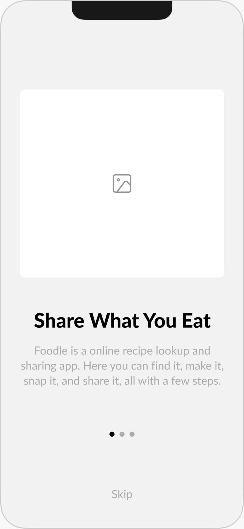
Foodle is a conceptual mobile app that takes research-driven data and crosses it with online content creation and collaboration. It allows users to find, create, photograph and share their favorite food and recipes with the world.


Foodle is a conceptual mobile app that takes research-driven data and crosses it with online content creation and collaboration. It allows users to find, create, photograph and share their favorite food and recipes with the world.
The broad idea that started this project was to create an application that was directed towards cloud storage and organization. From start to finish I utilized the design process to document my findings, create my wireframes & prototypes, and collect feedback from actual potential users. I would further refine my feedback and information into a high-fidelity prototype for my final deliverable.
I used the Design Thinking process to work through this project.
Our client had the idea to create a new application that would fit under the broad umbrella of online content storage. The focus for the app would be on content creation, organization and collaboration. To ensure positive growth the app needed to be able to leverage the "network effect." Keeping this in mind I knew that a social sharing application would have a strong foundation to build on. With this as my starting point, I began thinking about what people of all types might have in common.
The initial direction of the app was to be an app that would compete with Dropbox, Google Drive, and OneDrive. In an effort to steer the direction towards a more exciting idea that utilitizing some related technologies, I suggested a social social sharing app directed towards the broad concept of food. The app would leverage add, modify and delete recipe databases, uploading text and image data, search as well as share content with other users through different social platforms.
After researching features that industry competitors offered their users, I structured a series of interviews to narrow down my target audience and discover what features users would value in an app like Foodle.
To gauge interest in the idea of a collaborative food sharing app, I structured a series of interviews to help narrow down my target audience and discover what features users would value in an app.
The survey was given to 26 participants over 48 hours.


While the purpose of this survey was to gauge general information from a potential user base, it also was meant to propose feature ideas for my future app. I learned that people generally used collaboration in professional settings and not so much in personal ones. They also tended to share quite a bit online with those in their social groups, whether it be recipes or images of the food they consumed.
The creation of the Competitive Analysis started as the foundation for this project. Here, I aimed to identify three different competitors that had features similar to what the client was requesting.


The initial direction for the app was to follow in line with a file sharing and storage application. However, with the idea of tailoring it towards food, I was able to find and research competitors with similar features that fit the criteria. The three options I chose were TheFeedFeed.com, Pinterest and Instagram.
I learned that each competitor utilizes food as a topic, either partially or fully, and offer users different ways to interact with the platform.
However, each platform uses different features and no one platform contains all the features requested by the client. I also put together flow charts showing how these platforms handled common tasks and also served as a reference for similar implementation.
Of those surveyed, the two biggest age groups were ages 25-35 (38.9%) and 18-25 (22.2%). Of those two demographics, two main types of people were more readily apparent; students and professionals.
Filtering down the data into these two different personas gave me some insight on what types of features I should be considering.
Age: 22 | Location: Austin, TX | Sex: Female
College Student
"If only we could take pictures of morning coffees with custom tree designs in milk all the time! There would be no war in the world."
- Terry
Terry loves to look at various online repositories that feature images of food. She looks at many different sites, but has no way to catalog them effectively. She has used apps like Pinterest and Evernote, but they didn’t offer tagging features or searchable ways to find the images she was looking for easily. She finds inspiration in her photos by looking at other people just like her that do the same thing she does.
Age: 35 | Location: Riverside, CA | Sex: Male
Architect
"Meal prepping gives my soul inner peace in a way that three kids, a wife, and a mortgage never could."
- Hunter
Hunter loves his family, and wants them to be happy. He knows that good food is prepared with love and caring in the home, and knows that his family appreciates all that he has done for them. Hunter also likes to be in control of everything. He just can’t stand those quick easy trips to fast food restaurants down the street, and is very stern with anyone who would take his family to such places.
Considering the amount of tasks that were initially considered I began planning how to go about completing each task. After assigning priorities in the previous exercises I started mapping out my user flows. I chose to develop the app MVP as an iOS application instead of a web app to better leverage some of the hardware of the mobile device.
Here are the 13 user flows that I chose to work with in:


Getting my user flows down on paper gave me a good start as to how many steps users would take to get to the end of the task. It also allowed me to get to visualize how those steps would need to be connected to other steps.
With the user flows finished, I began thinking more granularity about the content and actions of the app. Aside from the screens, I needed to determine what actions I wanted to have. Creating an outline really helped with consolidating what would go where.
Doing some work on color schemes and imagery gave me a good idea on where I wanted to take the app design in later stages. Even though the initial design changed in later iterations, this was an important step to take as I was able to reference what I did here and see what worked and what needed improvements.
I also began working out how tasks could logically be organized within the app by creating a sitemap. This was helpful in sorting out where I wanted information to be accessed within the app.

Using my sitemap as my guide, I brainstormed content layouts utilizing low-fidelity sketches for both mobile and desktop viewports. This helped work out flow layouts from screen to screen as well as assisting in broader thinking for screens I had not originally accounted for.


Before digging my hands into the visual design of the app, I first needed to cook up a name! Through several mind-mapping sessions and snack breaks I eventually came up with the name Foodle. It’s a fun and quirky combo that embodied the oodles of food, fun and friends that can be found within this app. Initial logo sketches were created and moodboards pulled together which eventually lead to a fun, fresh and delicious feel to this new app.


Reviewing other references along with the moodboard choices put me in a good position to start working on a draft of Foodle’s style guide. This allowed me to further narrow down specific imagery, colors, and typography usages to assist with future styling needs. This formal style guide was meant to aid future developers and marketers on how to utilize the Foodle brand.


Referencing the Branding and Style Guide I began to refine my low fidelity wireframes into high fidelity mockups. I utilized the new branding bright colors and worked within the established iOS guidelines to refine the proportions of this MVP. Utilizing Figma’s component system made working with instances of each unique occurrence a breeze, and helped with the consistency in the final product.


Prototype was designed for viewing on a Desktop computer only. Viewing on other devices might show unintended results.
For the first round of testing I selected individuals that represented the demographics my personas were built on. The initial tests included two in-person interviews and one remote interview. Each test was presented as initial wireframes where the aim was to test the basic usability of the app.
During these tests I discovered that in-person testing was easier overall. I was physically with the individuals and could gauge body language and listen as the worked through each scenario. Each tester had a familiarity working with mobile apps and didn’t have a moment where they were stuck. They were able to provide valuable insight on what could be improved on in later testing.
One thing I learned in these tests was how privacy was a concern amongst these users. I learned that users wanted to try out the app prior to providing their personal info, just in case they didn't want to commit fully to the app. Adding another place to sign in after bypassing the welcome/login screens would likely help solve this problem.
Adding confirmation screens and user feedback screens was also requested. When users where interacting with the wireframe prototype they were expecting more details to be shown on screen other than the basics of each screen.
Provided below is the script that I followed with my test subjects, the notes that I took during our sessions, and the prototype that I used within those sessions.
There were a few times where I went back and forth about including specific elements even after establishing a solid art direction for the MVP. Deciding to do Preference Testing allowed for testers to remark on which style they liked best. I found it really useful since I was looking for more immediate reactions instead of long thought out reasonings as to why they would choose one over the other.
Testing was done via a link provided through Slack and similar messaging apps, and subjects were friends and other peers from Bloc. While the test was active I had a total of 20 participants that gave their opinions.
Which Tab Bar Design Do You Prefer?
Since Foodle was meant to provide users a way to photograph their content to share with other users, I wanted to have a dedicated camera button for users to easily tap to access this feature. My first attempt to address this was to have it as an icon on the Tab Bar with its name below. While it conveyed the message, another approach I wanted to go with was having a circular button in the center of the bar.
This was similar to the shutter button on iOS and I believed users would relate to this one more. I was correct in that assumption, however, what I found was the protruding arch at the top of the button was covering content, and I found that problematic when scrolling through content. I took the idea of B and confined it to the height of the Tab Bar. The final solution looked much cleaner and still was easy to understand.


Which icon styling do you prefer?
I wanted to give users the option to delete their selected meal plans and chose to present this with a persistent button on each item. No swiping actions or hidden gestures, just tap to delete the item. I wanted to see how this would translate without the color background and just adding the icon along with a dark gradient. The users tested found option A to be more visually appealing than B.


Which button style do you prefer?
For this test I was looking for feedback on a style of button that persisted on the screen as the user scrolled through the content. I had used the pattern shown in option A before on the recipe screen, and thought it would work well on the recipe card screen as well. I also thought of using a floating button that had the same persistent on screen behavior. My initial feeling on B was that it was too similar a design to the 'meal plan' button at the top of the card. Testers felt the same and agreed option A would be the winner.


Prototype was designed for viewing on a Desktop computer only. Viewing on other devices might show unintended results.
During the second round of testing I decided to try a different approach and completed these tests all remotely. I received valuable feedback that allowed my prototypes to be more expressive in the future. However, using this method caused my timeframe working on the prototype to balloon more that expected.
Instead of testing linear user flows like before, I prototyped all the screens together into a comprehensive prototype. While time consuming to put together, I knew this would help give an almost fully immersive view of the app even without full functionality.
In the prototype the journey for the user starts by choosing whether to sign in to the app or not. Their choice would take testers to different screens. In spite of the fact that the testing was done over the phone, the testers were impressed with the level of thought and detail that went into the prototype. The feedback given focused more on the visuals than the interactions, and I made sure to implement most of their feedback into the final version of Foodle’s MVP.


Prototype was designed for viewing on a Desktop computer only. Viewing on other devices might show unintended results.
The solution I proposed was to explore the idea of food as a unifying concept that could incorporate sharing, content creation and collaboration. These were the biggest deliverables our client requested and following this approach allowed for more creative exploration in a niche area not over-saturated by a multitude of similar applications.
Developing an idea that would solve the client requirements while engaging an audience in a unique way was an exercise in creative problem solving. The idea of Foodle as an app, where users could find and share recipes, was solid and received good feedback from people who could utilize such an app in it actually existed.
In a fast paced society where most people are only interested in how quickly they can have their finished product, few people are interested in the process by which those products come into being. Much less the feedback needed to make them great. Learning how to ask the right questions and follow up on that very important feedback was crucial to reaching the end result of this project.
The level of detail and coordination that I eventually needed to go through in the Usability Testing stage surprised me. That, along with unknowingly going into those tests with some preconceived ideas about how a user would think, made me realize that some of the revisions made were unnecessary. It made me realize ways that I can refine my own testing methods to better gather information instead of churning out frustrated revisions.
Gauging the time needed to do a thorough project is something that is hard to visualize in the beginning. Having a great idea and giving yourself time to do the research beforehand will save you a lot of time in the future.
